Mix and match
Ceramics has been having a moment for a moment now.
Dirt seems like the perfect anti-screen. It’s real, it’s physical, it’s messy, and there’s no command/control Z.
Here’s how Toby Brundin, the director of Ceramic Art London summed up the appeal: “There are no shortcuts in the making. If you lose concentration, you’re screwed. It’s so rudely analogue that it’s an antidote to the analytical, screen-based way that most of us spend our working, and a big chunk of our non-working, lives. People are craving physical experience.”
Interestingly, many people are discovering the craft through the decidedly screen-based experience of scrolling through Instagram.
As someone who is currently hooked on the wheel, there’s no doubt that years of following Julie Ahn’s (aka @objandtotem) gorg ceramics feed had something to do with wanting to give it a try. I started a year ago, and as I’ve excitedly described to countless friends since, “forcing dirt into submission through sheer will” is an amazing feeling.
Someone else who feels similarly is Seth Rogen, bro-comedy auteur, actor, director. Also: avid potter and pottery-Instagrammer.
As he waxed lyrical to New York Magazine’s The Cut, “There’s something about how you’re literally trying to center something. [Laughs.] The metaphors abound. But there’s inherently something meditative about it. I do like tactile things; I like to produce tangible work. With movies, we spend years on them and then they’re very intangible.”
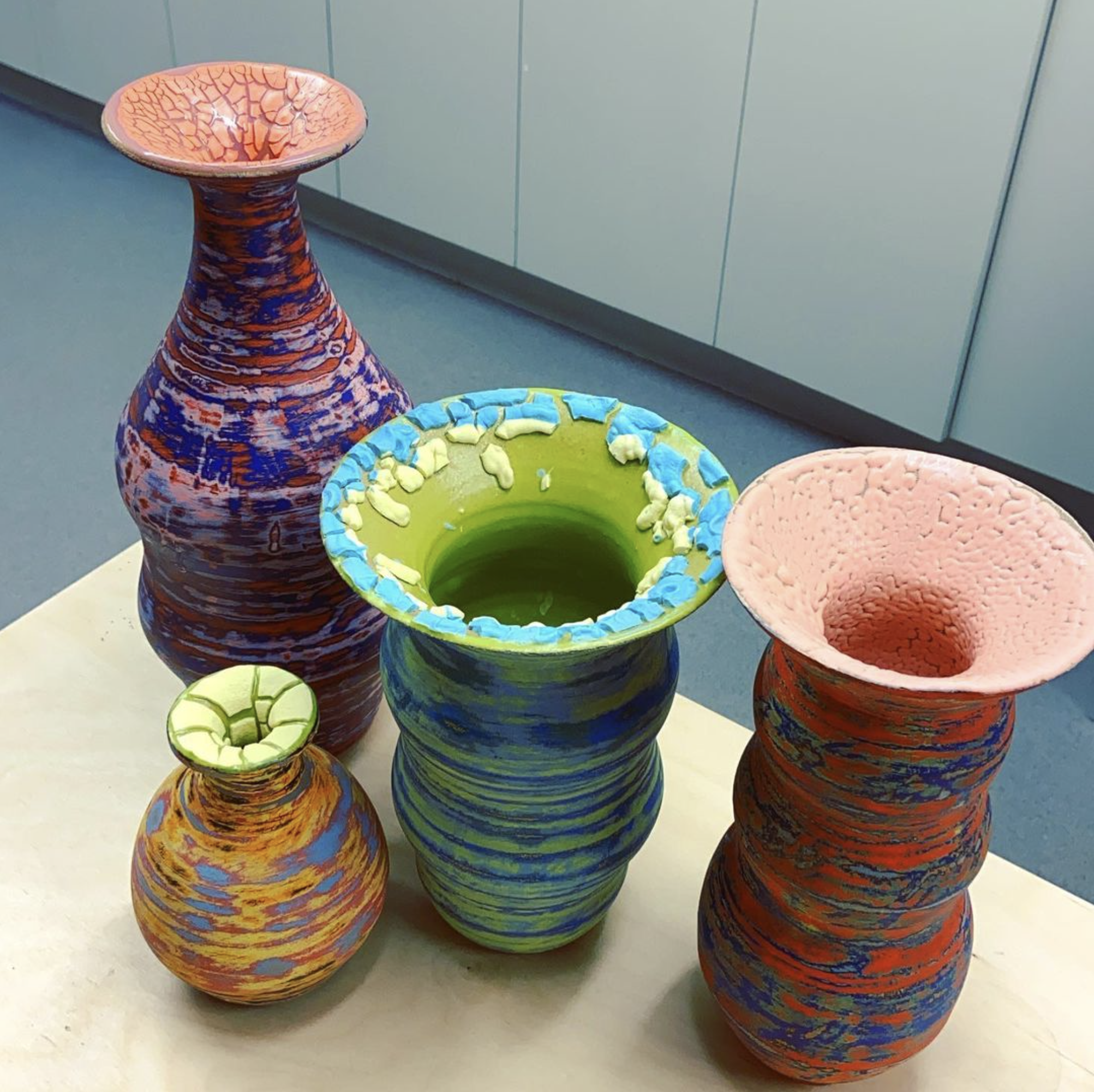
It turns out that Seth Rogen’s tangible work is a spiritual cousin of Seth Rogen’s intangible work. Is it really any surprise that the guy who made Pineapple Express and This is the End makes vases that look like this?
Image source. Some of Seth Rogen’s tangible work.
The attraction to multicolored glaze is not hidden from its maker. Seth explained that he’s well-aware of being drawn to bright, varied colors: “One thing that I saw a lot of with pottery in general is earth tones. I’ve always just been drawn to very colorful art, for lack of a better way of categorizing it. I think very unnatural colors have been something that I’m very drawn to in pottery."
Does the draw of bright colors have something to do with sensation seeking, which I gather Seth enjoys?
Because there is fun research on most any interesting topic, one study examined this possibility by asking 60 participants to complete what honestly sounds like a pretty relaxing experimental task. Everyone was given an image of a human figure and asked to paint in the figure’s clothes with a standard set of paints.
Afterward, everyone filled in a survey about their sensation seeking, which was made up of a number of subscales (dimensions like disinhibition and thrill seeking). The goal was to examine relationships between types of sensation seeking and the choices people made in their paintings.
And there were relationships. People who were disinhibited were more likely to use more than one color on the figure’s clothes than those who weren’t. And people who were thrill seeking tended to use more activating colors, like red, orange, and yellow to paint, while people who were thrill avoiding tended to use calming colors like gray, brown, and blue. (If you remember, we previously talked about the link between blue and trust, for those situations where thrill-seeking is a no-go).
Moody greys
Another reason for preferring bright colors, versus earth tones, might have something to do with wanting to capture a certain mood.
Browns and greys have some doom and gloom to them. And people who are anxious or depressed tend to associate these colors with how they feel.
In one study, participants were asked to choose a color that best described their mood and which color best represented them. In both cases, those who chose brown or black tended to be more depressed than those who chose other colors.
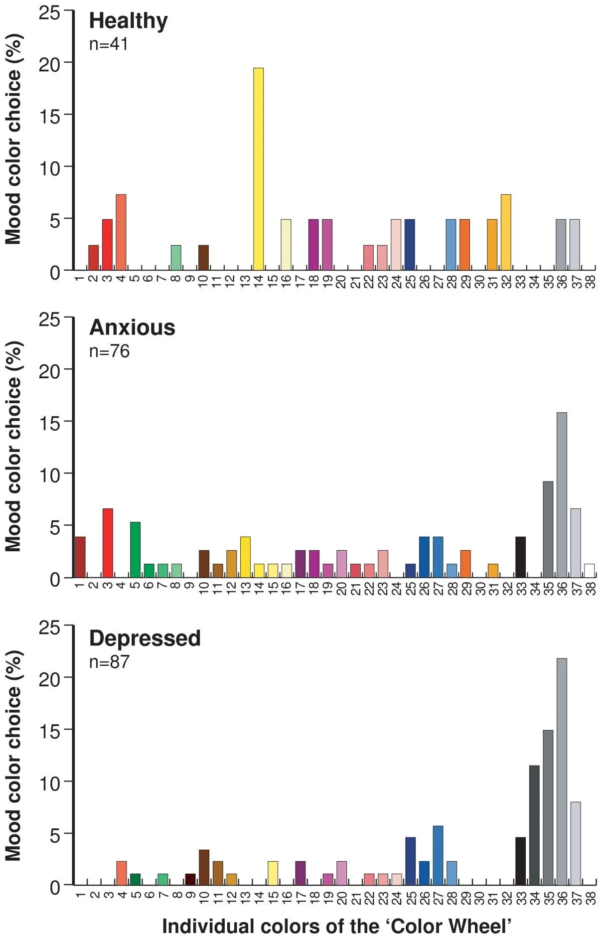
Another study had similar findings. Three groups of participants were asked to associate their recent mood with a color (“With regard to your day-to-day mood over the last few months - do you associate it with a particular color? If so, which color?”), choosing from among a diverse selection of shades. Study participants were either anxious, depressed, or neither anxious nor depressed.
People without anxiety or depression tended to associate their mood with a sunny yellow, and, more rarely, other saturated colors.
In contrast, people who were anxious or depressed tended to pick greys as best representing their mood. And, interestingly, people who were depressed were more likely to choose desaturated colors (compare the color choices in the top and bottom graphs below).
Image source. People who were anxious or depressed tended to pick greys as best representing their recent mood.
Colorful photos
Is there anything else that the colors of people’s Instagram photos, whether filled with vases or not, might tell us? A study on the link between personality and Instagram photos revealed some interesting relationships.
In this study, 179 participants in South Korea took a personality survey measuring the big five personality traits (which we’ve previously talked about here) and granted researchers permission to analyze their Instagram photos. This group had posted over 25 thousand photos in total.
Each person’s photos were analyzed for their colorfulness, color diversity, and color harmony –first within each photo and then aggregated across photos for each individual.
Agreeableness was the personality trait that most strongly predicted the color qualities of the photos. More agreeable people tended to post photos that were more colorful, more diverse in their colors, and that had a greater color harmony.
Some other relationships turned up as well – more extraverted people tended to post photos that were more diverse in color and people who were less emotionally stable (aka those who were more neurotic) to post photos that had lower color harmony. Perhaps surprisingly, people who were more open to experience tended to post photos that were less diverse and less harmonious in their colors.
So all else being equal, someone posting varied, though harmonious, colorful vases, I mean photos, is probably pretty agreeable.
Applying to practice
How might these findings be applied to practice? Here are a few ideas, but I’d love to know if you think of others:
Since sensation seekers are drawn to more activating colors and color variety, products or brands that appeal to sensation seeking and disinhibited behavior, like impulse buys, should probably be more colorful.
Given that people who are more anxious or depressed tend to associate their moods (and even themselves) with darker, desaturated colors, maybe the products and even environments that they interact with could change throughout the course of treatment. For example, some of the apps I found that are trying to address depression and anxiety are really, really colorful, which I could imagine might initially be off-putting to the target audience. Perhaps the color variety and saturation within these apps could increase over time to match people’s changing inner states?
The colorfulness of Instagram photos could be used to categorize people’s personality traits. The authors of the Instagram study described above suggest that corporations mine the photos of customers to reveal their personalities, which could then presumably be harnessed to better target ads. This moves too far into Cambridge Analytica-y territory for me personally, but it certainly seems possible (here’s some of the original research that effort was based on).

